Learn Histograms in Python with Matplotlib — Step-by-Step with Code
A histogram is like a bar chart's nerdy cousin — it doesn't just compare things, it shows how your numbers are spread out. Instead of labels like "Apples" or "Oranges," you get ranges like 0–10, 10–20, and so on. It's perfect for spotting patterns in things like test scores, survey results, or the ages of your favorite superheroes.
When Should You Use a Histogram?
Use a histogram when you want to understand how your data is spread out — like figuring out what range most test scores fall into, or how often certain temperatures occur. If your data is continuous (like age, marks, height, or time), a histogram is way more helpful than a pie chart or line graph.
Real-Life Examples of Histograms
- Student scores: Want to know how many students scored between 60–70 or 90–100? A histogram makes it crystal clear.
- Fitness tracking: Track how many days you ran for 10–20 mins vs 30–40 mins in a month.
- Weather data: See how often the temperature stayed between 20–30°C this summer.
- App usage: How much time do people spend on your app each day? A histogram shows the most common ranges.
- Salary analysis: Understand how many employees earn within specific brackets — super useful in HR reports.
Step-by-Step Code Example
Here's a simple example of how to create a histogram in Matplotlib:
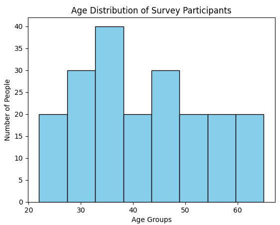
import matplotlib.pyplot as plt

# Sample data: Ages of 200 people
ages = [22, 25, 29, 30, 32, 33, 35, 36, 38, 40,
        42, 44, 45, 48, 50, 52, 55, 58, 60, 65] * 10

# Create the histogram
plt.hist(ages, bins=8, color='skyblue', edgecolor='black')

# Add titles and labels
plt.title("Age Distribution of Survey Participants")
plt.xlabel("Age Groups")
plt.ylabel("Number of People")

plt.show()
Output of the above code:
Understanding the Code Step-by-Step
Let's break down what's happening, one line at a time — no boring jargon, just clear logic.
import matplotlib.pyplot as plt
Grabs Matplotlib's plotting tools. Think of this like opening your paintbox before making a graph.
ages = [...] * 10
Our sample data — a list of ages repeated 10 times to mimic a group of 200 people for a more realistic visualization.
plt.hist(ages, bins=8, color='skyblue', edgecolor='black')
This is where the histogram is actually made. bins=8 groups the data into 8 age ranges. color and edgecolor keep it neat and readable.
plt.title() / plt.xlabel() / plt.ylabel()
Adds context — a title and axis labels so the chart makes sense at a glance without anyone having to guess what the numbers mean.
plt.show()
The final line that says: all set — now render and display the chart.
Customize Your Histogram
Histograms don't have to be boring. You can tweak colors, borders, transparency, and bar style to make your data look clear and polished:
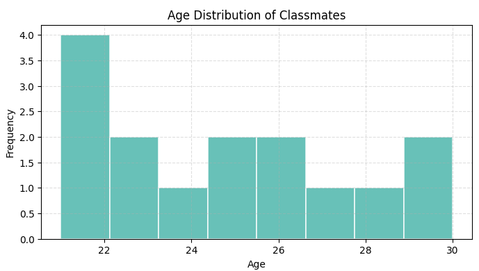
import matplotlib.pyplot as plt

ages = [21, 23, 25, 22, 26, 29, 21, 25, 27, 30, 24, 23, 22, 28, 26]

plt.hist(
    ages,
    bins=8,             # Number of bars
    color='#4db6ac',    # Soft teal fill color
    edgecolor='white',  # White borders between bars
    linewidth=1.2,      # Border thickness
    alpha=0.85,         # Slight transparency
    histtype='bar'      # Try 'step' or 'barstacked' too!
)

plt.title("Age Distribution of Classmates")
plt.xlabel("Age")
plt.ylabel("Frequency")
plt.grid(True, linestyle='--', alpha=0.4)
plt.show()color: changes the fill color of each bar.edgecolorandlinewidth: adds clean borders between bars.alpha: controls transparency — useful when overlaying two datasets.histtype: try'step'or'barstacked'for different visual styles.
Output of the above code:
Mini Project: Visualize Exam Score Distribution
Let's say you've got the exam scores of 50 students. Build a histogram to visualize how those scores are spread out — who's topping, who's in the middle, and how many are lagging behind.
- Take a list of 50 student scores (random or user input).
- Create a histogram with 5 or 10 bins to see score distribution.
- Customize it with colors, gridlines, and titles.
- Make it readable for a quick classroom insights dashboard.
Bonus: try grouping scores like 0–20, 21–40, and label them smartly. Perfect for teachers, students analyzing trends, or just solid Python practice.
plt.bar() for custom segments, or add a vertical mean line with plt.axvline(x=mean_score, color='red').
Common Histogram Mistakes to Avoid
Hides important patterns — clusters, peaks, and outliers all get swallowed into a handful of fat bars.
Makes the chart noisy — random fluctuations start looking like meaningful trends when they're not.
Histograms are for numerical data only. If your data has labels like "Apple" or "Banana", use a bar chart instead — a histogram won't make sense here.
No labels means the reader has to guess what the numbers mean. Always add a title, x-axis label, and y-axis label — it takes 3 lines of code.
Inconsistent bins across plots leads to misleading comparisons. Keep the bin count the same whenever you're comparing two histograms side by side.
Extreme values stretch the histogram and squash everything else. Always check for outliers before reading the distribution shape.
Frequently Asked Questions
plt.hist(data, bins=10) — pass your data and it handles the grouping automatically.plt.hist(data, bins=10) and pass your data list plus the number of bins you want. Add plt.title(), plt.xlabel(), and plt.ylabel() for labels, then call plt.show() to display it.bins controls how many bars your histogram has. Each bin is a range of values. Too few and you lose detail; too many and it gets noisy. Start with 8–15 bins and adjust from there based on how the chart looks.Bar Graphs · Customize Graphs · Pie Charts · Multiple Line Graphs · Line Graphs · Scatter Plots