Multiple Line Graphs — Who's Actually the GOAT?
One line graph tells a story. Two lines on the same graph start an argument. That's the whole vibe of multiple line graphs — you put two (or more) datasets side by side and let the chart do the talking. Who's been more consistent? Who peaked and then fell off? The graph will tell you.
Why bother with multiple lines?
Because comparing stuff is way more interesting than just looking at one thing. Imagine plotting Virat's runs vs Rohit's runs across 30 matches — suddenly you've got context. Or compare your screen time this week vs last week. Or two stocks. Or two playlists' skip rates. Anything where you've got the same X-axis and want to see how different Ys behave — this is your chart.
What is a multiple line graph in Python?
A multiple line graph is a chart that displays two or more lines on the same graph.
It is commonly used to compare trends, performance, or changes over time.
In Python, multiple line graphs are created using Matplotlib by calling
plt.plot() multiple times.
What you'll learn
- Plot multiple lines on one chart without making it a mess
- Use colors, markers, and legends so each line is instantly readable
- Call
plt.plot()multiple times — yes, it's really that simple - Position the legend so it doesn't cover your actual data
- Tell a visual story — comebacks, crossover points, and consistent dominance
Code: Joe Root vs Steve Smith across 30 matches
Classic debate fuel. Let's settle it visually — dummy data, but the code is 100% real:
import matplotlib.pyplot as plt
import numpy as np

Joe_Root = np.array([28, 62, 15, 110, 33, 8, 70, 92, 45, 60,
                     81, 39, 20, 75, 13, 18, 67, 41, 99, 50,
                     103, 58, 36, 61, 49, 88, 4, 10, 29, 73])

Steve_Smith = np.array([23, 55, 47, 29, 83, 17, 66, 87, 40, 34,
                        51, 27, 90, 63, 36, 31, 21, 60, 70, 44,
                        78, 69, 48, 57, 39, 74, 12, 97, 65, 26])

plt.figure(figsize=(10, 5))
x = np.arange(1, 31)

plt.plot(x, Joe_Root, label='Joe Root', color='#184452', marker='o')
plt.plot(x, Steve_Smith, label='Steve Smith', color='#77cce6', marker='o')

plt.title('Joe Root vs Steve Smith')
plt.xlabel('Matches', fontdict={'fontname': 'Comic Sans MS', 'fontsize': 15})
plt.ylabel('Scores', fontdict={'fontname': 'Comic Sans MS', 'fontsize': 15})

plt.legend(bbox_to_anchor=(1.05, 1), loc='upper left')
plt.grid(True, alpha=0.7, linestyle='--')
plt.show()
Two arrays, 30 scores each. The data is made up but the technique is real — this is exactly how you'd compare any two players, products, or people over time.
What each line of code is doing
- Two
plt.plot()calls — that's it. One for each player. Matplotlib stacks them on the same chart automatically. np.arange(1, 31)— creates match numbers 1 to 30 for the X-axis. No manual typing needed.- Different colors —
'#184452'(dark navy) for Root,'#77cce6'(light blue) for Smith. Make them contrast enough that you can actually tell them apart. marker='o'— puts a dot at every data point so you can see exactly where each match score lands.bbox_to_anchor=(1.05, 1)— pushes the legend outside the chart so it doesn't sit on top of your lines.plt.grid(alpha=0.7)— faint grid lines. Makes the chart readable without being distracting.
Output:
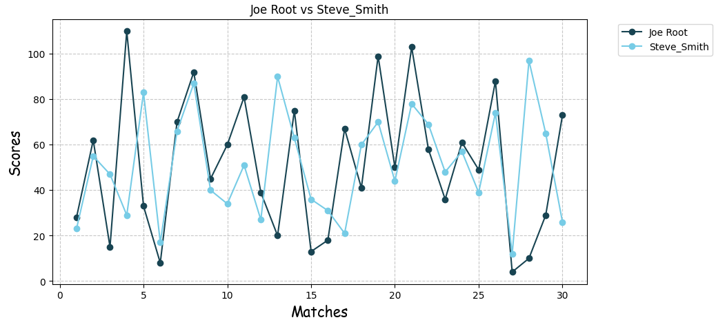 Two lines, two players. You can instantly see who had the more consistent season and who had the wilder swings.
Real-world applications of multiple line graphs
- Sports rivalries: Player A vs Player B across a season — who's actually performing?
- Personal stats: Your screen time this week vs last week. The dip on Wednesday hits different visually.
- Finance: Two stocks, one chart — see when they diverge and when they move together.
- School grind: Your marks in two subjects over the year — are you consistently better at one, or did they flip?
- Any "A vs B over time" question — if it has a timeline and two things to compare, this chart fits.
Mini project: Battle of the GOATs
Pick 2–3 of your favorite players — cricket, football, basketball, whatever you follow — and track their performance match by match this season. Use real stats or make up data to practice the code.
- X-axis: Match number or date
- Y-axis: Goals, runs, assists, wickets — whatever metric matters
- Give each player a distinct color so it reads instantly
The graph will tell you who's been consistent, who had a hot streak, and who's been completely ghosting this season.
plt.annotate() to call out their best and worst games directly on the chart, and title it "Battle of the GOATs: 2025 Season Stats" — because why not.
Frequently asked questions
What is a multiple line graph?
A multiple line graph displays two or more datasets on the same graph for comparison. Each dataset is drawn as a separate line, making it easy to spot differences in trend, pace, or consistency.
How do you plot multiple lines in Matplotlib?
Call plt.plot() separately for each dataset before using plt.show(). Each call adds a new line to the same chart — no extra setup needed.
When should I use a multiple line graph?
Use it when comparing trends over time — player performance, stock prices, website traffic, or really anything where the same time axis applies to more than one thing.
Can I use different colors for each line?
Yes. Pass a color parameter inside each plt.plot() call. Hex codes like '#184452' work, and so do named colors like 'red' or 'steelblue'.
Bar Graphs · Customize Graphs · Pie Charts · Histogram · Line Graphs · Scatter Plots