Line Graphs in Python — Your Data Finally Looks Good
You've got data. It's just sitting there in a list looking boring. A line graph fixes that — slap it on a chart, and suddenly you can actually see what's going on. Going up? Going down? Some chaotic spike in the middle? The graph will tell you what the numbers never could.
We're using Matplotlib — the most popular Python library for this stuff — and by the end you'll have a working line graph, know how to style it, and have a mini project to flex.
So when do you actually use a line graph?
Any time something changes over time. That's it. That's the rule. Some examples that actually make sense:
- Your screen time going absolutely feral on weekends
- Daily temperatures across a month
- How your website traffic grows (or doesn't, and that's fine)
- Stock prices doing whatever they want
- Study hours across the week — the honest version
If your X-axis is time and your Y-axis is literally anything, a line graph belongs there.
What you'll actually learn here
- Plot your first line graph in Python without breaking anything
- Add axis labels and a title so the graph isn't just vibes
- Customize the line — color, thickness, style, markers
- Use
plt.show()to make it actually appear on screen
The code — copy it, run it, tweak it
Here's a clean working example. Run this and you'll get a proper line graph in under 10 seconds:
import matplotlib.pyplot as plt

# Your data
Category = ['A', 'B', 'C', 'D', 'E', 'F']
Values = [10, 20, 15, 25, 10, 30]

# Draw the graph
plt.figure(figsize=(8, 5))
plt.plot(Category, Values,
         color='#1f77b4',
         marker='o',
         linestyle='-',
         linewidth=2,
         markersize=8)

# Labels and title
plt.xlabel("Category", fontsize=12)
plt.ylabel("Values", fontsize=12)
plt.title("Basic Line Graph Example", fontsize=14, fontweight='bold')

# Grid makes it readable
plt.grid(True, linestyle='--', alpha=0.5)

plt.tight_layout()
plt.show()
What's actually happening in each line
import matplotlib.pyplot as plt— loads the library.pltis just a shorthand everyone uses.- Category and Values — your X and Y data. Swap these out for whatever you're actually tracking.
plt.plot()— this is where the magic happens. All your styling options go in here.plt.xlabel()/plt.ylabel()/plt.title()— labels so your graph isn't a mystery to whoever reads it.plt.grid(alpha=0.5)— faint background grid. Makes values way easier to read.plt.show()— renders the chart. Don't forget this or nothing shows up.
Output:
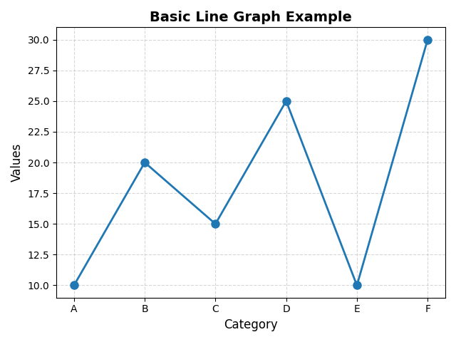 There it is. Clean, readable, yours.
Linestyle — change how the line looks
The line between your points doesn't have to be plain. Four options:
'-'— solid (default, clean)'--'— dashed (good for projections or "estimated" data)':'— dotted (subtle, works well on grids)'-.'— dash-dot (a bit retro but it exists)
Markers — dots on each data point
Markers show exactly where each value sits. Without them, the line just flows past. With them, you can see every individual data point.
'o'— circle (most common)'.'— tiny dot'*'— star (a bit dramatic, kinda love it)'s'— square'^'— triangle pointing up'+'— plus sign
Markersize and linewidth
Two parameters that go a long way:
- markersize — how big each dot is. Default is fine, bump it up if the graph is large.
- linewidth — how thick the connecting line is.
2is a solid default.
Usage: plt.plot(x, y, marker='o', markersize=10, linewidth=2)
Mini project: plot your screen time
Genuinely the most relatable dataset you have access to right now. Track your screen time for a week, then plot it. The graph will say things about you that you're not ready to hear.
- X-axis: Mon, Tue, Wed, Thu, Fri, Sat, Sun
- Y-axis: Hours on screen
Title it "This Week's Damage" and you're done. Bonus round: add a horizontal red line at your daily goal and see how many days you actually hit it.
plt.axhline(y=4, color='red', linestyle='--', label='Daily goal') — drops a flat reference line across the whole chart. Pair it with a legend and it goes hard.
Frequently asked questions
How do you plot a line graph in Python?
Import matplotlib.pyplot as plt, put your data in two lists, call plt.plot(x, y), add labels, then plt.show(). That's the whole thing.
What is Matplotlib in Python?
Matplotlib is a Python library for creating charts — line graphs, bar charts, scatter plots, histograms, pie charts. It's been around forever and basically every data science tutorial uses it.
What does linestyle do in Matplotlib?
It controls how the connecting line between data points looks. '-' is solid, '--' is dashed, ':' is dotted, '-.' is dash-dot. Pass it directly into plt.plot().
How do I add markers to a line graph in Matplotlib?
Add marker='o' inside plt.plot() for circles, marker='s' for squares, marker='^' for triangles. Size them with markersize.
When should I use a line graph?
When your X-axis is time and you want to see how something changes — screen time, temperatures, prices, scores. If there's no time component, a bar chart probably fits better.
Multiple Line Graphs · Customize Graphs · Pie Charts · Histogram · Scatter Plots · Bar Graphs