Scatter Plots in Python using Matplotlib (Beginner Guide)
Does cramming actually work? Let's use a scatter plot and find out. Scatter plots help us visualize relationships between two variables, making them one of the most useful charts in data analysis.
You know that one friend who swears they studied for 8 hours straight and still bombed the exam? Or the other one who crammed for 2 hours and somehow aced it? A scatter plot is literally built to answer "does X actually affect Y" — no guessing, no vibes, just data.
Each dot on a scatter plot is one person, one day, one event — plotted by two values. If the dots slope upward together, there's a connection. If they're all over the place, the relationship is cooked.
When should you use a scatter plot?
Scatter plots are one of the most commonly used charts in Python data visualization.
Using Matplotlib's plt.scatter() function, you can quickly identify trends,
correlations, clusters, and outliers in datasets. Whether you're analyzing student
scores, sales data, weather patterns, or machine learning datasets, scatter plots
provide a simple way to explore relationships between variables.
Real-life examples that actually slap
- Study grind vs exam score — does the all-nighter actually pay off?
- Instagram time vs sleep — how bad is the doomscroll damage, really?
- Gym sessions vs energy levels — does working out give you more energy or just make you tired?
- Money spent on ads vs sales — are brands just burning cash, or does it work?
Quick Start: Plot hours studied vs exam score
Classic debate, let's settle it with data:
import matplotlib.pyplot as plt

# Hours studied vs exam score for 11 students
hours  = [1, 2, 2.5, 3, 3.5, 4, 4.5, 5, 6, 7, 8]
scores = [40, 42, 48, 52, 55, 60, 64, 70, 78, 85, 90]

plt.figure(figsize=(7, 4))

plt.scatter(hours, scores, s=75, alpha=0.85, color='#e86c2f')

plt.title("Does Studying More Actually Help?")
plt.xlabel("Hours Studied")
plt.ylabel("Score (%)")
plt.grid(True, linestyle="--", alpha=0.35)

plt.tight_layout()
plt.show()
Breaking it down
plt.scatter(hours, scores)— first argument goes on X, second on Y. That's it.s=75— size of each dot. Make it bigger, make it pop.alpha=0.85— transparency. Useful when dots overlap and you can't see what's underneath.color='#e86c2f'— custom color. Use any hex code you want.plt.grid()— adds faint grid lines so you can actually read the values.
Output:
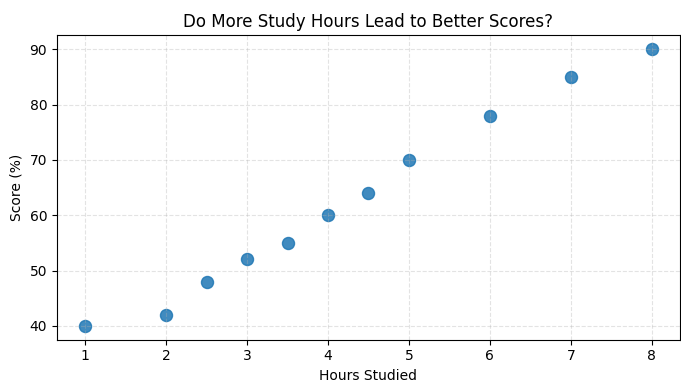 Clear upward slope — more hours = higher score. The data said what it said.
Make it more interesting
Color by group
Plot two groups — say, students who slept 8 hours vs those who pulled all-nighters — in different colors on the same chart:
import matplotlib.pyplot as plt

# Well-rested students
hours_rested  = [3, 4, 5, 6, 7, 8]
scores_rested = [60, 68, 75, 80, 86, 92]

# All-nighter crew
hours_tired  = [3, 4, 5, 6, 7, 8]
scores_tired = [45, 50, 55, 58, 62, 65]

plt.figure(figsize=(7, 4))

plt.scatter(hours_rested, scores_rested, s=80, color='#00b894', label='Well rested', alpha=0.9)
plt.scatter(hours_tired,  scores_tired,  s=80, color='#e86c2f', label='All-nighter', alpha=0.9)

plt.title("Sleep vs No Sleep — Who Actually Wins?")
plt.xlabel("Hours Studied")
plt.ylabel("Score (%)")
plt.legend()
plt.grid(True, linestyle="--", alpha=0.35)

plt.tight_layout()
plt.show()
🔹 Two plt.scatter() calls, different colors, one legend. The gap between those two lines? That's the cost of skipping sleep.
Quick customization tips
- Change dot size dynamically: pass a list to
s=[...]to make some dots bigger based on a third variable. - Markers: try
marker='x','^', or's'for different shapes. - Annotate outliers: use
plt.annotate("that one guy", (7, 40))to call out weird data points.
Mini Project: Weekly Temperature Tracker
Track the temperature every day for a week, plot it, and automatically highlight the hottest day with a different color. It sounds simple — but it teaches you list indexing, conditional logic, and scatter customization all at once.
- Store 7 days of temperature data in a Python list.
- Use
max()to find the hottest day. - Plot all days in one color, hottest day in a standout color.
- Add a label so the viewer instantly knows which day it was.
min(), .index(), and multiple plt.scatter() calls.
Frequently Asked Questions
What is a scatter plot in Python?
A scatter plot is a chart that displays the relationship between two numerical variables using dots. In Python, you can create scatter plots easily using Matplotlib's plt.scatter() function.
How do I create a scatter plot using Matplotlib?
Import Matplotlib, prepare your X and Y values, and use plt.scatter(x, y). Then add labels, a title, and call plt.show() to display the chart.
When should I use a scatter plot instead of a line graph?
Use a scatter plot when you want to examine the relationship or correlation between two variables. Use a line graph when you want to show changes or trends over time.
What does plt.scatter() do in Matplotlib?
The plt.scatter() function creates a scatter plot by plotting individual data points on a graph. It allows you to customize colors, sizes, markers, transparency, and more.
Can scatter plots show correlation?
Yes. Scatter plots are commonly used to identify positive correlation, negative correlation, or no correlation between variables. Patterns in the dots help reveal these relationships.
How can I customize scatter plots in Matplotlib?
You can customize scatter plots using parameters such as color, s (size), marker, alpha (transparency), labels, legends, and grid lines.
Hi, I'm Palak Mishra. I build backend applications with Python and create beginner-friendly programming tutorials for Kiddo. My goal is to make coding feel less intimidating and more fun for students who are just getting started.
Bar Graphs · Pie Charts · Histogram · Line Graphs · Multiple Line Graphs · Subplots