Pie Charts in Python with Matplotlib
Pie charts are great when you want to show how a whole is divided into smaller parts. Instead of comparing raw numbers, they help you quickly see which categories take up the biggest share.
Whether you're analyzing screen time, monthly expenses, vote shares, market share, or programming language popularity, a pie chart makes percentage-based data much easier to understand at a glance.
In this guide, you'll learn how to create pie charts in Python using Matplotlib, customize colors, add percentage labels, highlight important slices, and even turn a regular pie chart into a modern donut chart.
How plt.pie() works — in 5 steps
import matplotlib.pyplot as plt — that's your only import for a basic chart.
Two lists: one for values (the slice sizes), one for labels (the names). Values don't need to add to 100 — Matplotlib handles the percentage calculation.
Pass in your sizes, labels, and any styling parameters. One function call draws the whole chart.
plt.title("Your title here") — straightforward.
plt.show() renders the chart. Don't skip this or nothing appears.
Basic pie chart example
Let's start with a simple example showing programming language popularity. This is one of the easiest ways to understand how Matplotlib converts raw values into slices and automatically calculates percentages for each category.
import matplotlib.pyplot as plt

labels = ['Python', 'Java', 'C++', 'JavaScript']
sizes  = [40, 25, 20, 15]

plt.pie(sizes, labels=labels, autopct='%1.1f%%')
plt.title('Programming Language Popularity')
plt.show()
Now a more interesting version — how long the top 6 internet memes have been famous:
import matplotlib.pyplot as plt

memes = [
    "Pepe the Frog",
    "Doge",
    "This Is Fine Dog",
    "Distracted Boyfriend",
    "Woman Yelling at a Cat",
    "Grumpy Cat"
]
years_famous = [17, 12, 12, 8, 6, 13]
colors = ['#9fcbf5', '#67a6e0', '#2b85d9', '#1862a8', '#1b4f80', '#073b6b']

plt.pie(years_famous, labels=memes, autopct='%1.1f%%',
        startangle=140, colors=colors)
plt.title("Top 6 Memes by Years of Popularity (2025)",
          fontdict={'fontsize': 15})
plt.show()
Output:
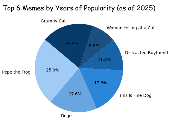 Each slice sized by how many years that meme has stayed relevant — Pepe the Frog takes the biggest cut at 17 years.
Key parameters explained
Everything you can drop inside plt.pie():
| Parameter | What it does | Example |
|---|---|---|
sizes | The data values — determines slice size. Doesn't need to sum to 100. | [40, 25, 20, 15] |
labels | Text shown next to each slice. | ['Python', 'Java'] |
autopct | Shows percentage inside each slice. '%1.1f%%' = 1 decimal place. | '%1.1f%%' |
colors | List of colors, one per slice. Accepts hex codes or named colors. | ['#e86c2f', '#3d5afe'] |
startangle | Rotates the starting position of the first slice. 90 = start at top. | startangle=90 |
explode | Pulls slices out from center. Value = fraction of radius. | [0.1, 0, 0, 0] |
shadow | Adds a drop shadow under the chart. | shadow=True |
wedgeprops | Styles the wedges — use width to create a donut. | dict(width=0.65) |
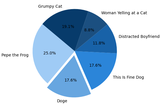
Explode a slice
Sometimes one category dominates the entire chart. Instead of letting it blend in with everything else, Matplotlib lets you pull that slice outward using the explode parameter.
It's a simple effect, but it immediately draws attention to the most important part of your data. Think of it as putting a spotlight on the slice you want readers to notice first.
explode = [0.1, 0, 0, 0, 0, 0]  # pulls out Pepe the Frog

plt.pie(years_famous, labels=memes, autopct='%1.1f%%',
        startangle=140, colors=colors, explode=explode)
plt.title("Pepe Leads — Explode Effect")
plt.show()
The value 0.1 means "pull this slice outward by 10% of the radius." Use 0.2 or 0.3 for a more dramatic separation. Every other slice stays at 0.
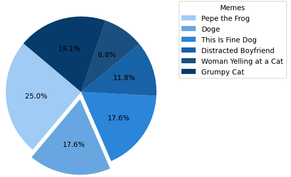
Move labels to a legend
When slice labels are long, they overlap on the chart. The cleaner solution is to remove inline labels and use plt.legend() instead:
# Remove labels= from plt.pie() — pass only sizes and styles
plt.pie(years_famous, autopct='%1.1f%%',
        startangle=140, colors=colors)

# Add legend outside the chart
plt.legend(memes,
           title="Memes",
           loc="upper left",
           bbox_to_anchor=(1, 1))

plt.tight_layout()  # prevents the legend from being clipped
plt.show()- Remove
labels=memesfromplt.pie()— otherwise labels appear twice bbox_to_anchor=(1, 1)— anchors the legend box outside the chart areaplt.tight_layout()— adjusts figure bounds so nothing gets cut off
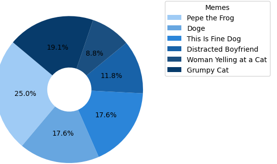
Donut chart with wedgeprops
Regular pie charts work great, but donut charts often look cleaner and more modern. They show the same information while leaving extra space in the center for labels, totals, or additional insights.
In Matplotlib, converting a pie chart into a donut chart only requires one extra parameter. The wedgeprops argument controls the appearance of each slice and can create the hollow center that gives donut charts their signature look.
plt.pie(years_famous, labels=memes, autopct='%1.1f%%',
        startangle=140, colors=colors,
        wedgeprops=dict(width=0.65))

# Optional: add a label in the center hole
plt.text(0, 0, "Memes", ha='center', va='center',
         fontsize=13, fontweight='bold')

plt.title("Meme Longevity — Donut Chart")
plt.show()
width=0.65 means each wedge is 65% of the full radius — leaving 35% hollow. Lower the number for a thinner ring. The optional plt.text(0, 0, ...) places a label right in the center hole.
When to use a pie chart
- Showing parts of a whole — budget, votes, time split
- Fewer than 6–7 categories
- Values are visually distinct (not too close to each other)
- You want a quick, high-level overview
- More than 7 categories — becomes unreadable
- Values are very similar — bar chart shows differences better
- You need precise comparisons
- Your data doesn't represent parts of a whole
Mini project — visualize your screen time
Your phone already has the data. Open your screen time or digital wellbeing settings, pull last week's numbers, and build a pie chart that shows exactly where your hours went.
plt.pie() with your apps as labels and hours as sizes.autopct, and rotate with startangle for balance.explode to pull out whichever app has the embarrassingly high number.wedgeprops=dict(width=0.65) and put total hours in the center with plt.text().plt.savefig('screen_time.png', bbox_inches='tight', dpi=150) instead of plt.show(). You'll have a shareable graphic ready to go.
Common pie chart mistakes beginners make
Pie charts are easy to create, but a few common mistakes can make them harder to read than they need to be.
- Using too many categories and creating tiny unreadable slices.
- Comparing values that are almost identical.
- Using similar colors that blend together.
- Exploding multiple slices at once.
- Forgetting percentage labels with
autopct. - Using a pie chart when a bar chart would communicate the data more clearly.
As a general rule, keep pie charts under seven categories and use them only when your data represents parts of a whole.
Frequently asked questions
plt.pie(sizes, labels=labels, autopct='%1.1f%%'), then plt.show(). That's the core of it — everything else is optional styling.'%1.1f%%' shows one decimal place — so values like 23.5%. Remove it entirely if you only want labels without numbers.explode list to plt.pie() with a non-zero value for the slice you want to pull out. Example: explode=[0.1, 0, 0, 0] pulls the first slice out by 10% of the chart radius. Increase the value for a bigger separation.wedgeprops=dict(width=0.65) inside plt.pie(). This sets each wedge to 65% of the radius, hollowing out the center. Adjust width between 0.3 (thin ring) and 0.9 (thick ring) to control the look.labels= from plt.pie(), then call plt.legend(labels, title='Title', loc='upper left', bbox_to_anchor=(1, 1)). Finish with plt.tight_layout() so the legend doesn't get clipped outside the figure bounds.Bar Graphs · Scatter Plots · Multiple Line Graphs · Line Graphs · Histogram · Subplots